


The growth of London's outer suburbs
Don't take my word for it - there are also sexy maps!

I didn’t name my online presence The Underground Map for no reason. London maps - especially vintage ones - are a bit of an obsession.
My social media accounts and this Substack all inherit this The Underground Map name and variously concentrate on London history.
My similarly-named website is on a quest to discover the location of every street which has existed since the 1750s and geolocate them on a series of old maps. This is aimed largely towards people researching genealogy - finding that long-disappeared road mentioned on a 1901 census somewhere in bombed-out Hackney and placing it on an old map. But it’s also interesting comparing the streets where you live now with maps of the area from the 1860s, 1890s and 1950s.
While a lot of new streets replaced bombed streets, many more in what is now outer London were built on former green fields.
The London County Council (LCC) had been formed at the close of the nineteenth century to govern the then urban spread of London under one council. Before the LCC, London was governed by various parishes and counties whose authority overlapped with the Metropolitan Board of Works.
The Metropolitan Board of Works (MBW) served as London's upper-tier local government from 1856 to 1889. Its primary role was infrastructure improvement, though it also managed parks and open spaces through a dedicated committee that established several landmark parks. The MBW's jurisdiction covered London and significant portions of Middlesex, Surrey, and Kent during the 33 years before the LCC was established. But it was all a bit of a mess. To get anything done, the MBW would have to coordinate with a lot of civil servants, elected people and locals, all with aspects of jurisdiction over the suburb.
Setting the boundaries of the constituent boroughs of the LCC was a task to fulfil for new committees as was deciding the outer limit of the London County Council. London’s urban expansion had gobbled up large parts of Middlesex, Surrey and Kent by 1889.
Middlesex previously covered the local area north of the Thames and west of the River Lea with the exception of the square mile of the City of London (under its own governance). The reason that Middlesex cricket is based at Lord’s is because until 1889, Lord’s was situated in the county. Middlesex county council offices were also now in the new LCC area and so they moved to Brentford.
Surrey previously covered the local area south of the Thames and west of the River Ravensbourne at Deptford. East of here, including Greenwich, was Kent. Similarly, the reason that Surrey cricket is based at The Oval is because until 1889, the ground was situated in Surrey and Surrey stretched all the way to the southern foot of London Bridge.
The new London County Council took over every contiguous section of the urban area of London and administered the capital much more efficiently. The new LCC was also designed with a green perimeter around its outer edge.
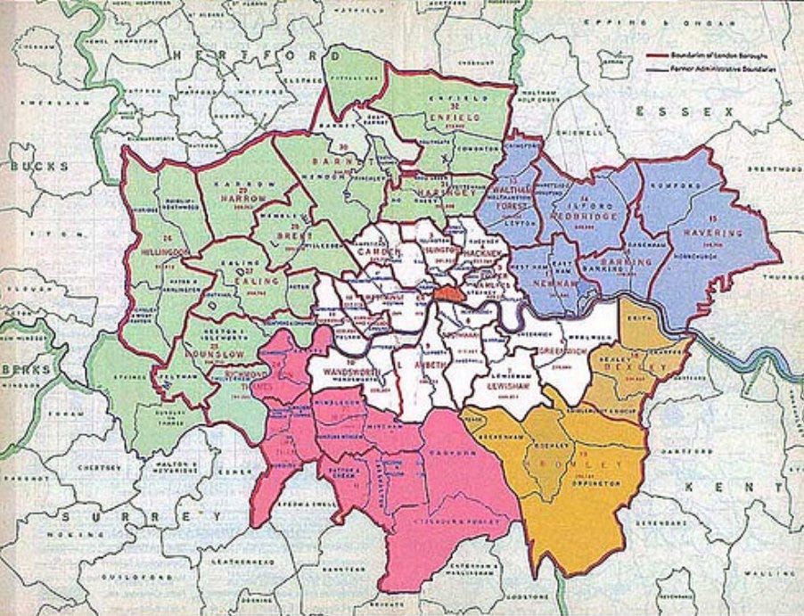
The map above dates from the 1960s and shows the post-1965 boundary of the new Greater London Council (solid red line) and the former London County Council area (in white).
Although the LCC boundaries had been set up with their green perimeter, there was no Green Belt law until 1945, and so London carried on expanding between 1889 and 1914.
Quite coincidently, the LCC boundary by the time of the advent of the First World War roughly marked the limit of growth of London at that point. What is depicted as the London County on the map, is roughly the size of the capital’s urban area in 1914. Beyond the LCC boundary, Middlesex, Surrey, Kent and Essex remained countryside.
The road vehicle had not come of age and the limit of the pre-World War One expansion was largely governed by the railways.
Most Londoners before the coming of the railways, lived in areas where they could walk to work. After the coming of the railways they lived in areas where they could walk to the station, take a train and then get to their workplaces.
This caused Victorian-era growth in the Middlesex and Surrey towns such as Willesden or Battersea at the limit of a decent walk to the nearest station. Nearest to the new stations would be working class housing within easy walking distance of the station. Those who owned their own carriage could live in larger villas slightly further away. Then, in the outer towns, came the countryside.
After a slower period of growth until the First World War, London saw an unprecedented boom in the late 1920s and early 1930s. The development of other public transport options – the tube lines, trams and later the private car allowed the spread of the suburbs on a huge scale. Willesden grew and merged with growing Kilburn in one direction and with growing Harlesden in the other direction until there was nothing in between to say where Willesden became Harlesden or Kilburn.
Huge numbers of very similar styles of housing covered the former fields. If you were parachuted blindfold into the new suburban streets of Wembley, Wandsworth or Forest Gate, you’d have to find the nearest signpost with a marked postal area to tell which part of London you were in. This is because London mostly inherited the housing design fashion of the interwar years.
When the First World War ended, London’s growth finished at Cricklewood, Kensal Rise, East Ham and Dulwich. In the 21 years between that event and the start of the second war, London had reached Edgware, Upminster, Bromley and Chessington.
Then came the Greater London Council in 1965. Again the border of the GLC marked where the expansion of London had reached, now contained by the Green Belt acts
I’m not here today to sympathise with the 1930s villagers of Perivale or Goodmayes about the loss of their farmland. Or discuss the social aspects of commuting. Or indeed urban morphology.
Oh no. It’s more exciting than all that.
I’m here today to show in graphical form what I outlined above. I’ve discovered a fantastic website which has apparently been around since 2016 but is new to me.
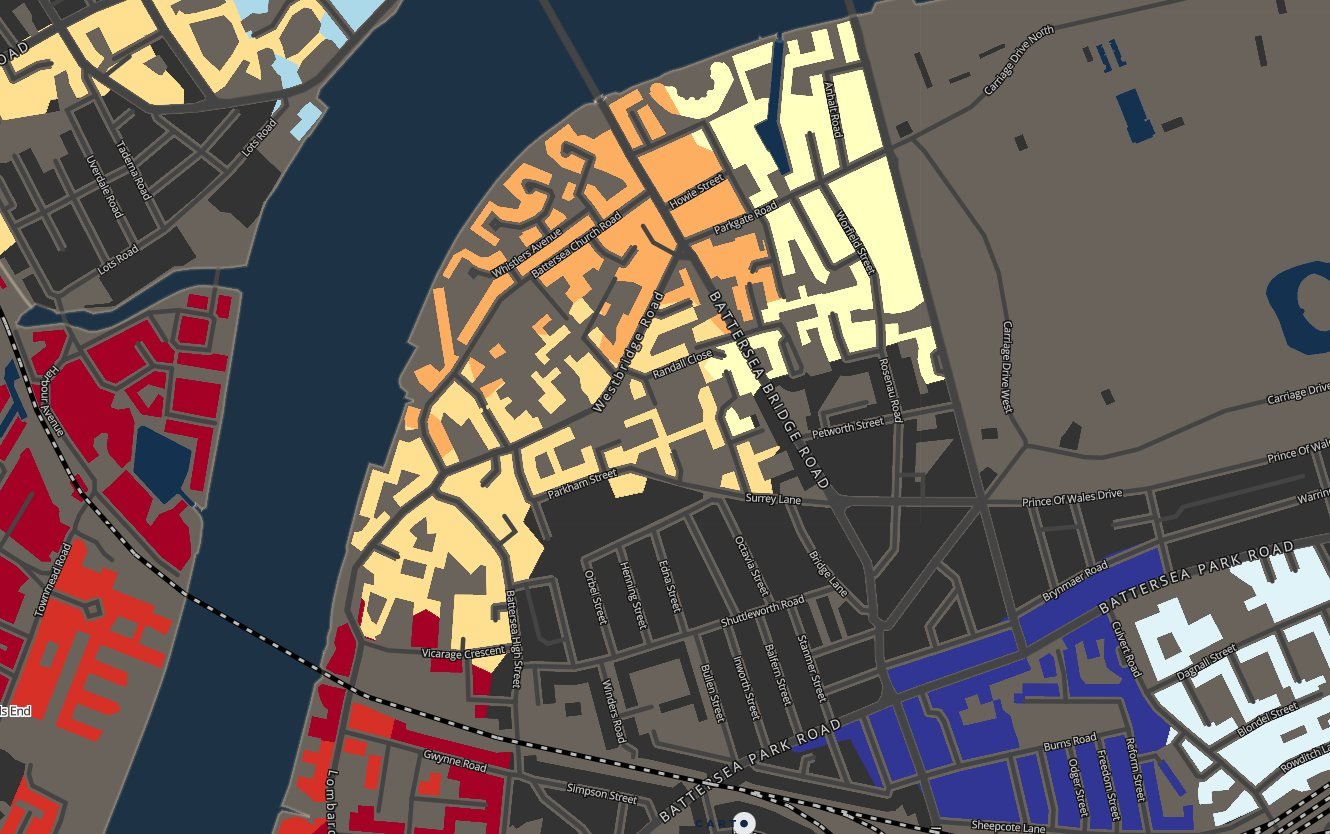
The Consumer Data Research Centre (CDRC) has produced an amazing Google Map style interface for the whole of the UK which allows a view of the growth of London in the example link that I am providing:
mapmaker.cdrc.ac.uk/#/dwelling-ages-prices?d=11110000&m=dwe_modbp1&lon=-0.0996&lat=51.508&zoom=10
At this zoom level and with this dataset (dwelling ages), the interwar London growth can be seen in various shades of blue, the pre-First World War growth can be seen in various shades of black. Bombed and dockland areas, redeveloped after the Second World War can be spotted in various shades of red.
You can see that Willesden, surrounded by postwar blue, has a Victorian dark grey core at the limit of where its nineteenth century residents would tolerate a walk to the station.
You can zoom into street level to see when your area was built and when a neighbouring area was built. After you’ve done that, you can waste an evening, playing with the various datasets they provide. Energy usage in Stornoway? The E-food desert index of North Yorkshire? Enjoy!
Used to live in Ickenham when I was groing up, School in Ruislip, local station West Ruislip ( 100 yds away) , they will always be Middlesex to me, and still put that on envelopes :-)